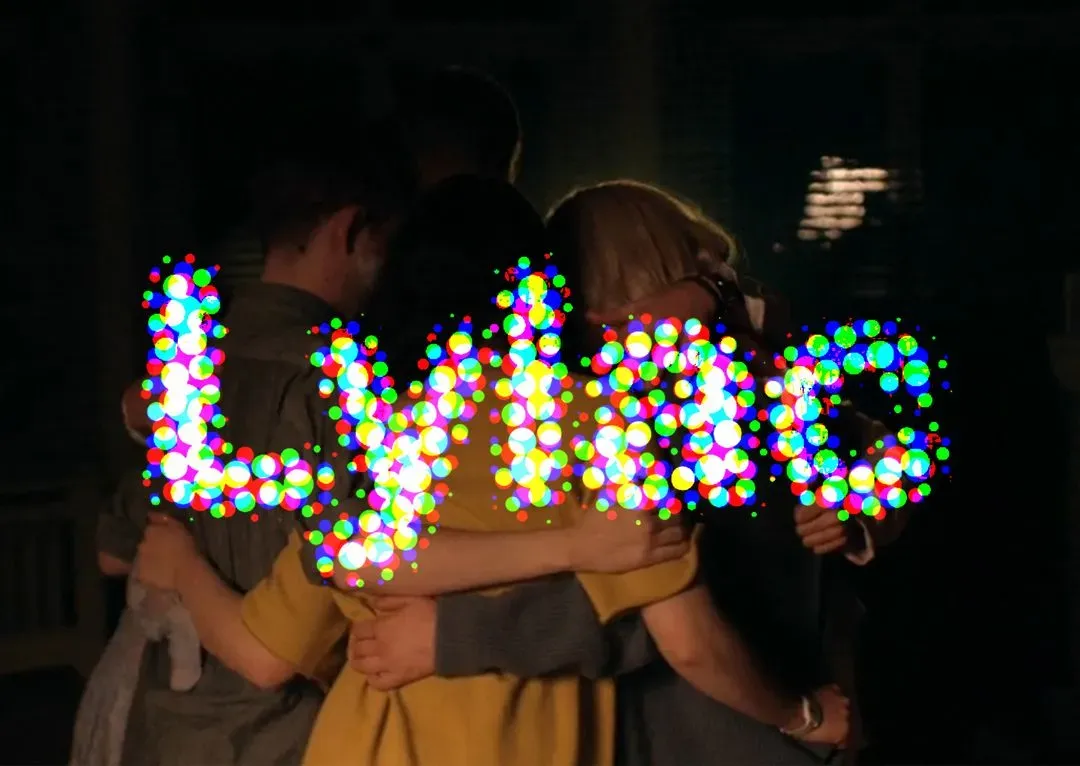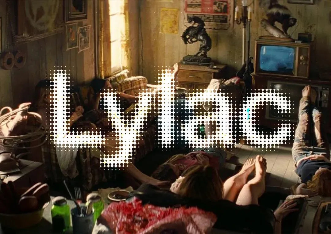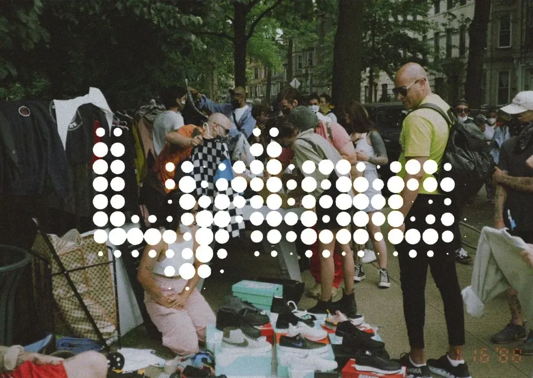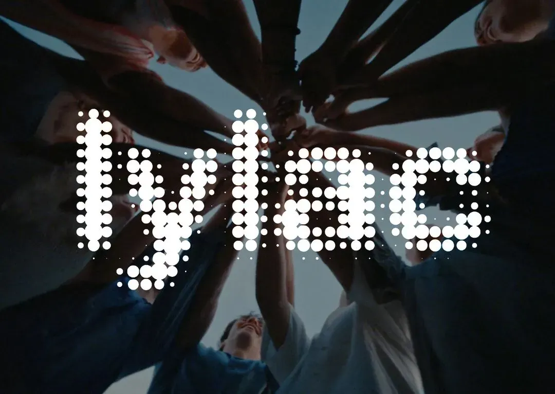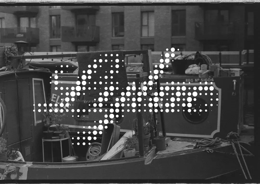
What do we think about the dots?
The idea is that it represents how lylac is a community formed by many, instead of being one thing . Everybody contributes to lylac and lylac is shaped by everyone and everything on here, which is why I like the idea that everyone matters and that we as a whole, make up the platform. But I’m unsure whether it looks a bit gimmick-y . What do you think? Do you think it represents the concept well, or can you think of another that might represent us better? Thanks!